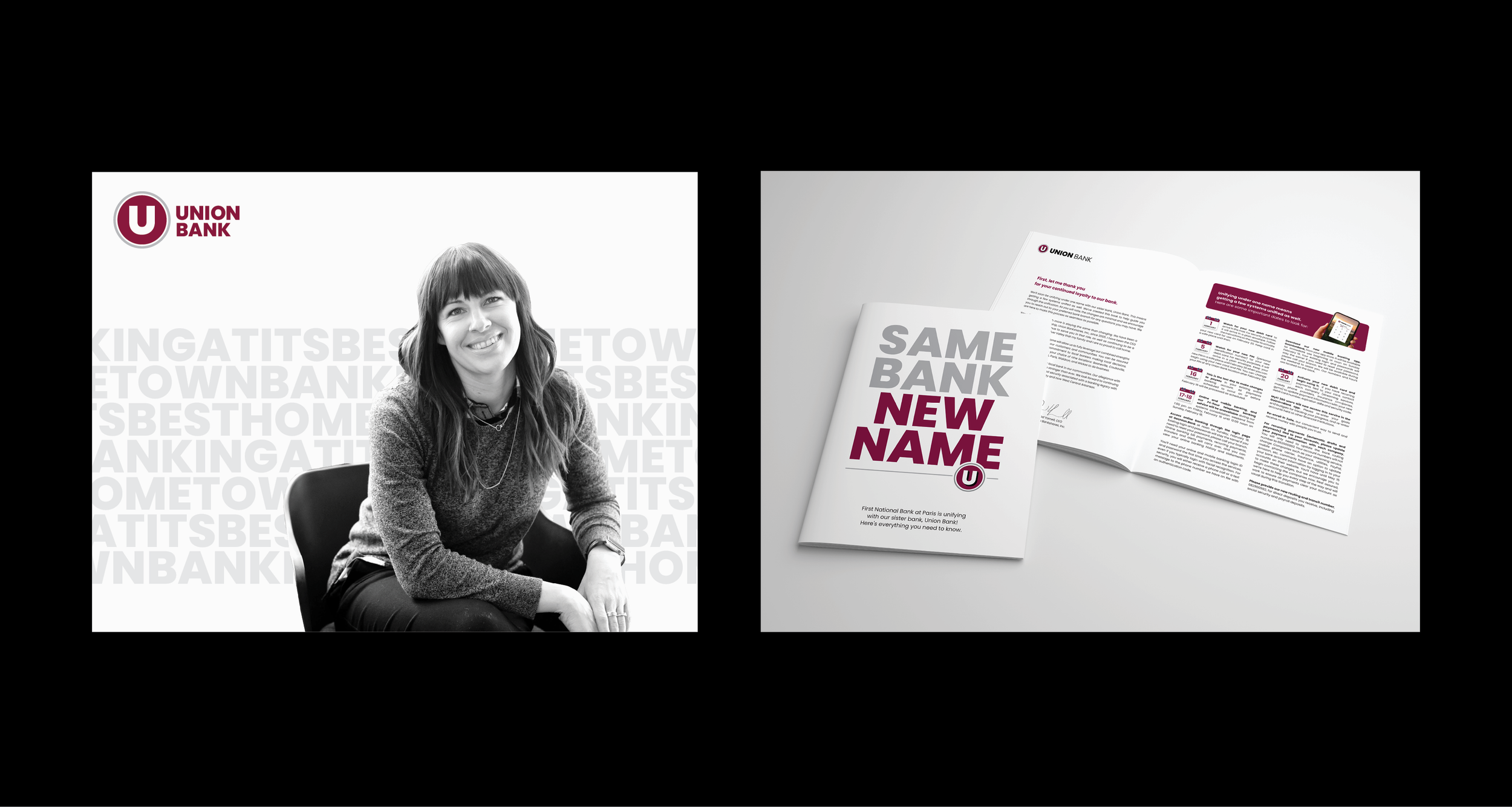
Come Together
Union Bancshares in southwestern Arkansas had an identity problem. Having three bank brands in the family caused confusion for employees and customers alike, and limited their ability to project strength and stability and on a regional scale.
Merging those brands into a unified “Union Bank” meant increasing the efficiency of communications and operations, and resulted in a bank that felt larger and more confident, without losing that hometown feel customers have been enjoying since 1891.

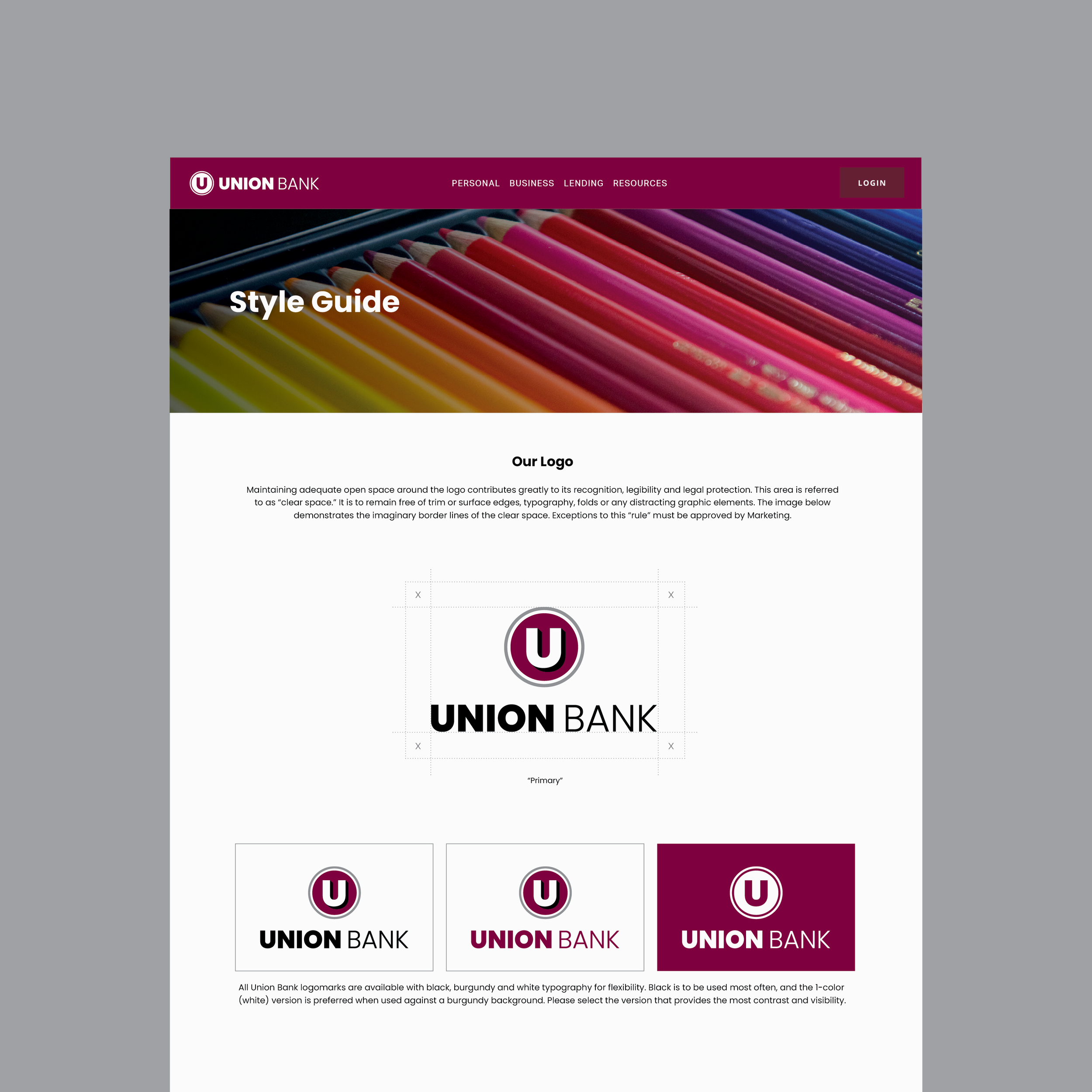
Because the “U” was recognized in many of the bank’s markets, the internal team chose to keep it, but asked if we could “make it less chubby!” The result was a streamlined, professional, and decidedly more “fit” logomark.