
Akeso Fitness Water: The Power of (CBD-infused) H20
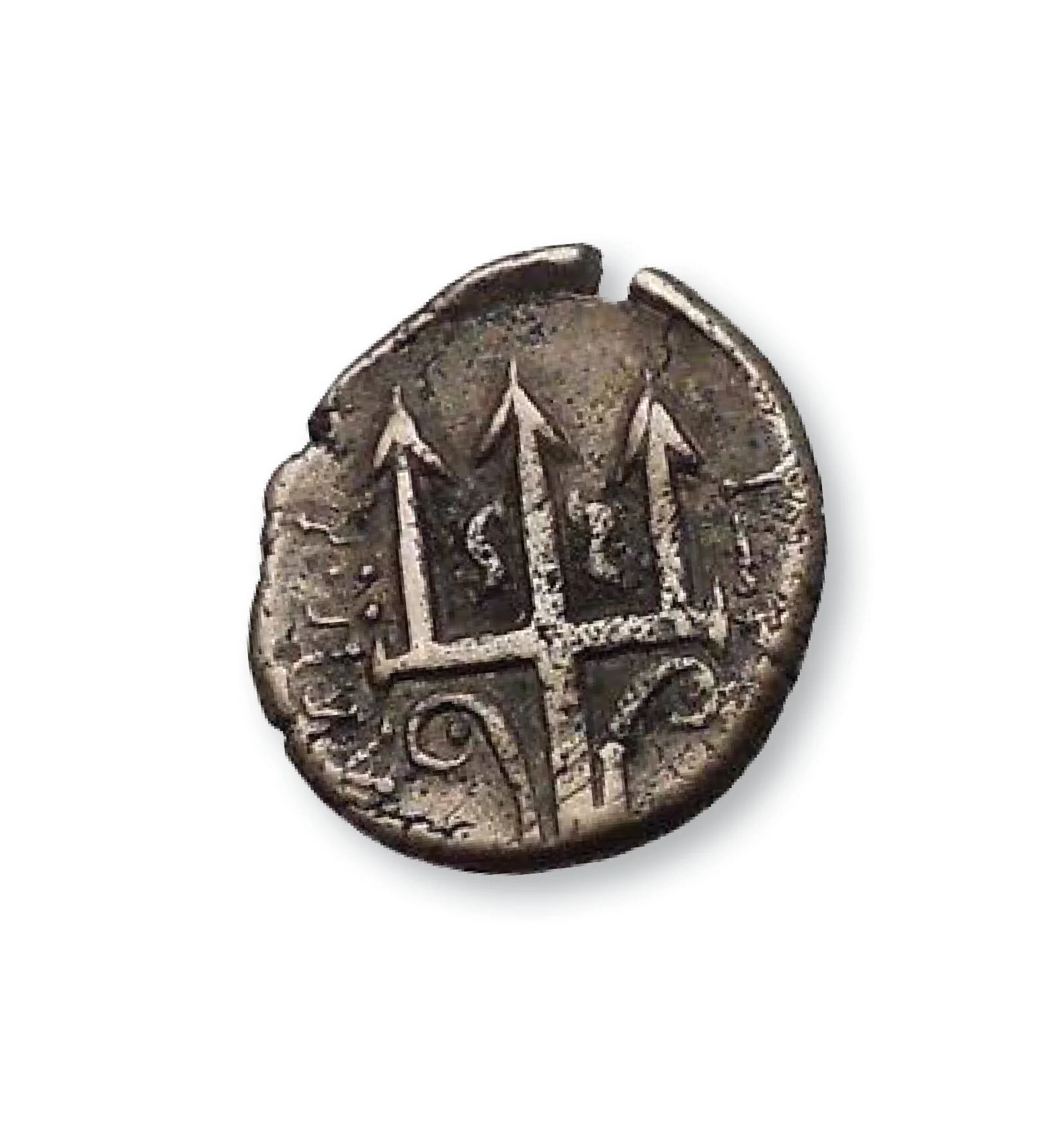
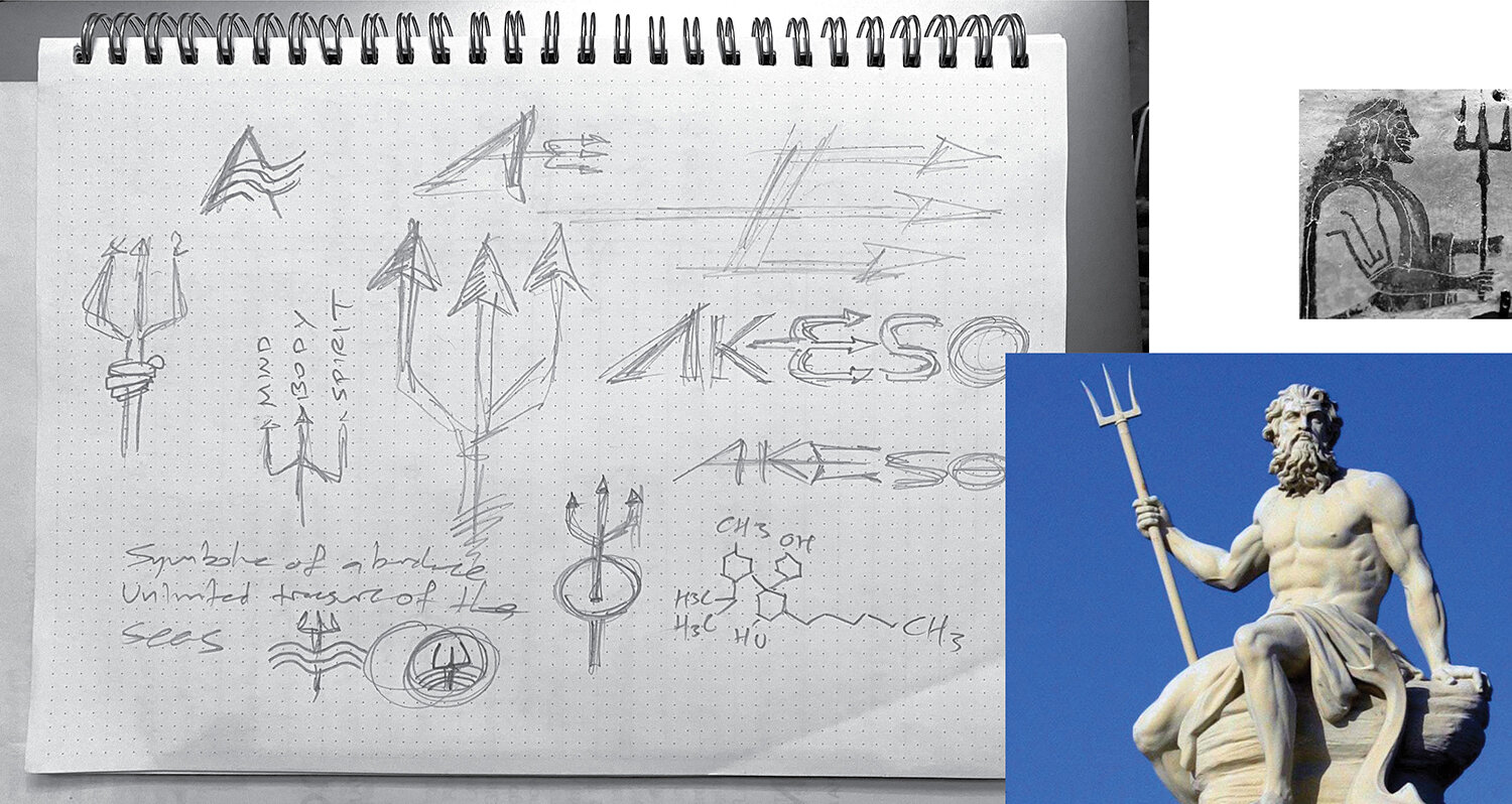
When Poseidon was furious, he struck the sea with his mighty trident, causing huge waves and storms. In ancient Greece, the trident was a symbol of abundance and wealth, used on many coins and talismans throughout ancient civilizations. In this design concept for Akeso Fitness water, the trident was chosen as a metaphor for an athlete’s drive to conquer their inner doubter and achieve their fitness goals.


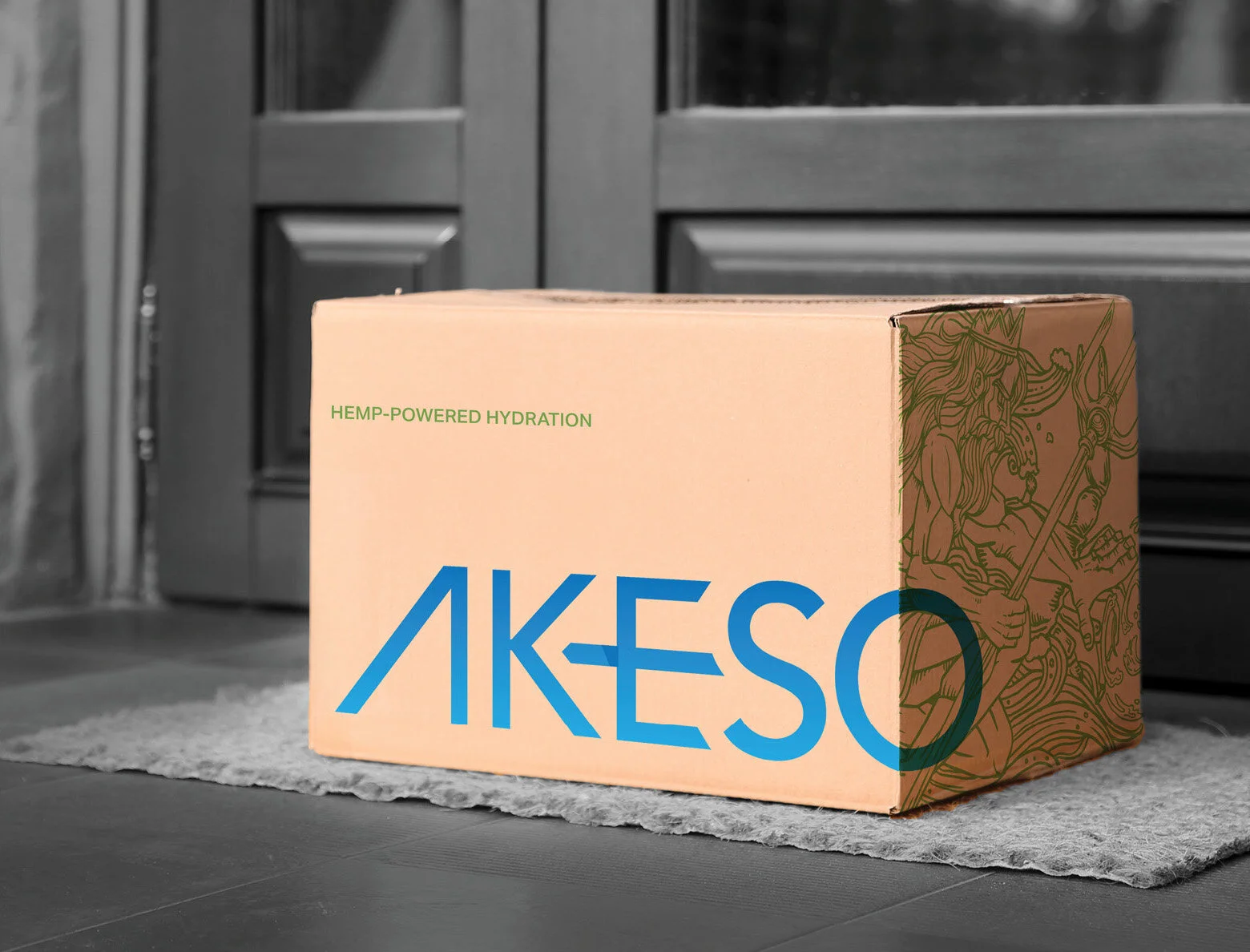
Hemp-powered Hydration for both Activity and Recovery
Akeso is electrolyte-rich water that also happens to taste great. It contains no flavor, sugar or artificial anything, but uses the science of CBD extraction to make a positive impact on your body’s own immune system, stress and inflammation. The trident’s 3 prongs represent Akeso’s benefits to your mind, body and spirit.


In the end, Akeso selected a different design strategy for the product – one that focused more on the science instead of the benefits to athletes. This was a sound strategy, and the company looks poised to gain market share in the coming years. That being said, this exploration shows the benefits of looking at all potential angles of a brand’s design strategy before choosing the one that feels right.
photo credits:
Sven Mieke, Unsplash
Tembela Bohle, Pexels
Asoggetti, Unsplash
Shutterstock